PROJECT:
Shipping Email Series
In 2017, The Children’s Place shifted its gears towards more omni-channel initiatives. With that came a huge focus on how its mostly-in-store brand expression and customer experience should be translated and improved digitally. Our first projects involved updating customer communication emails because of their lack of brand personality and readability. I was tapped to work on the transactional series because I love working through customer journeys!
Teams: Email Marketing, Customer Service, Copy & Design, Email Production
Challenge(s)
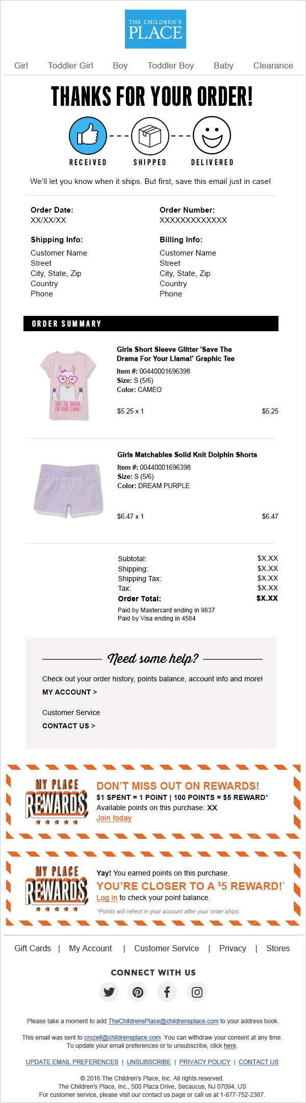
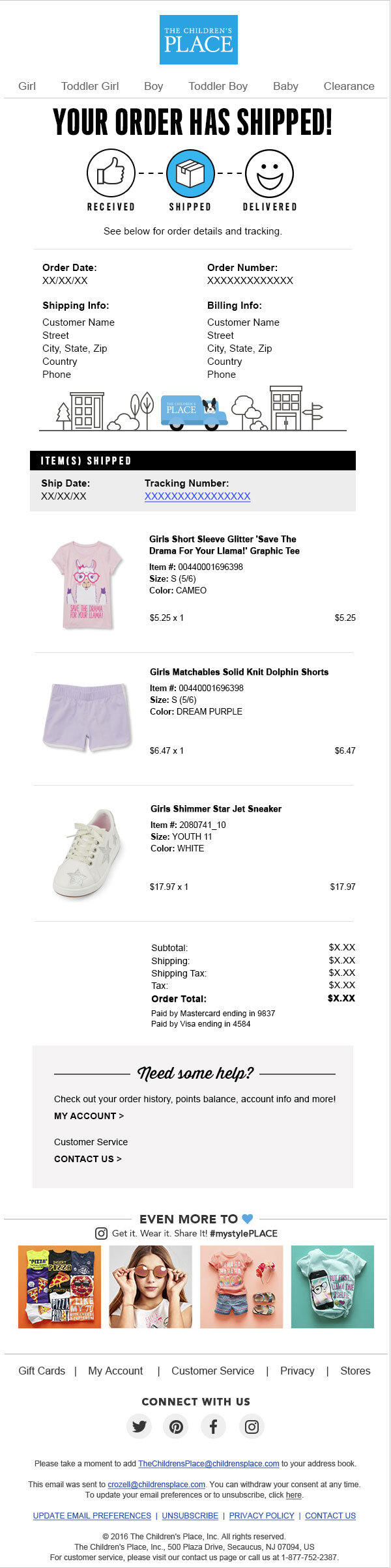
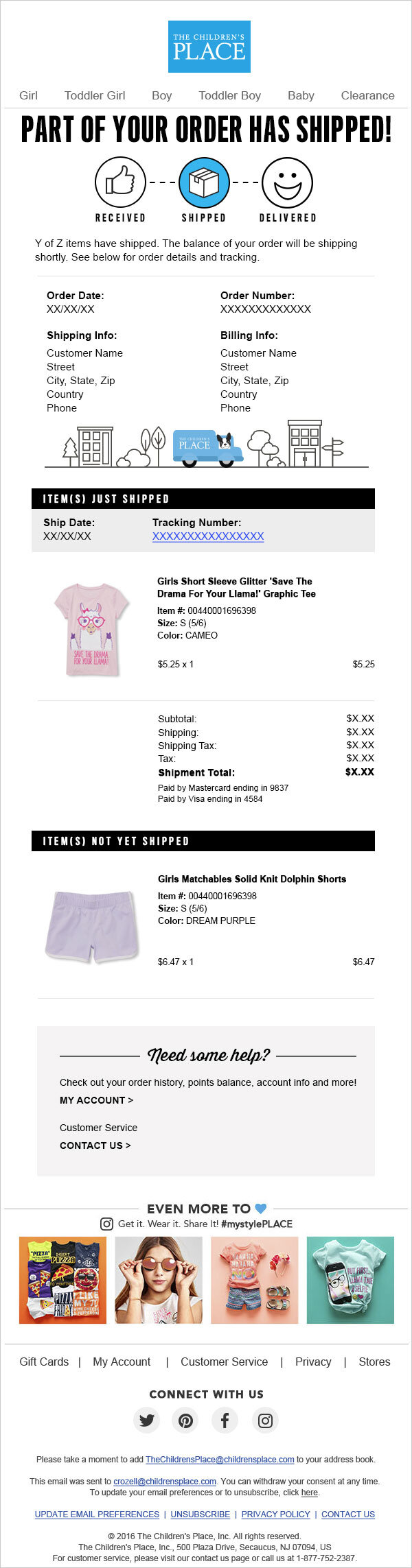
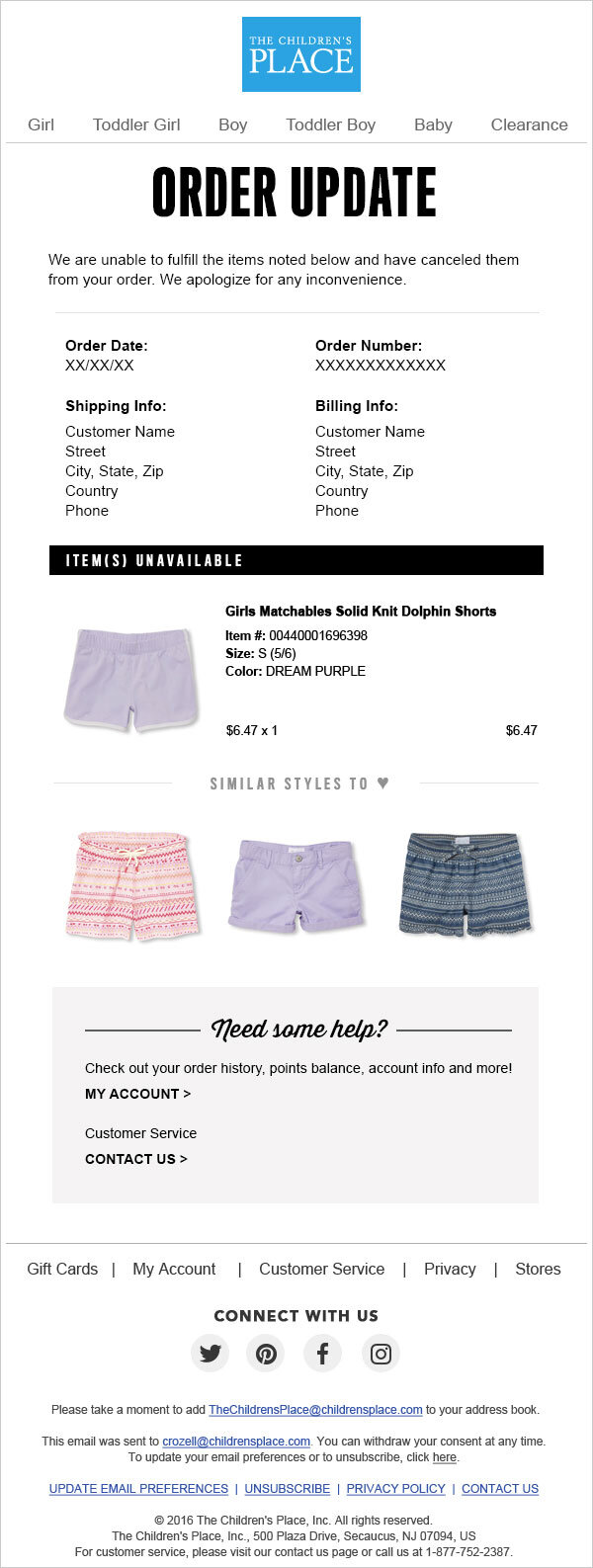
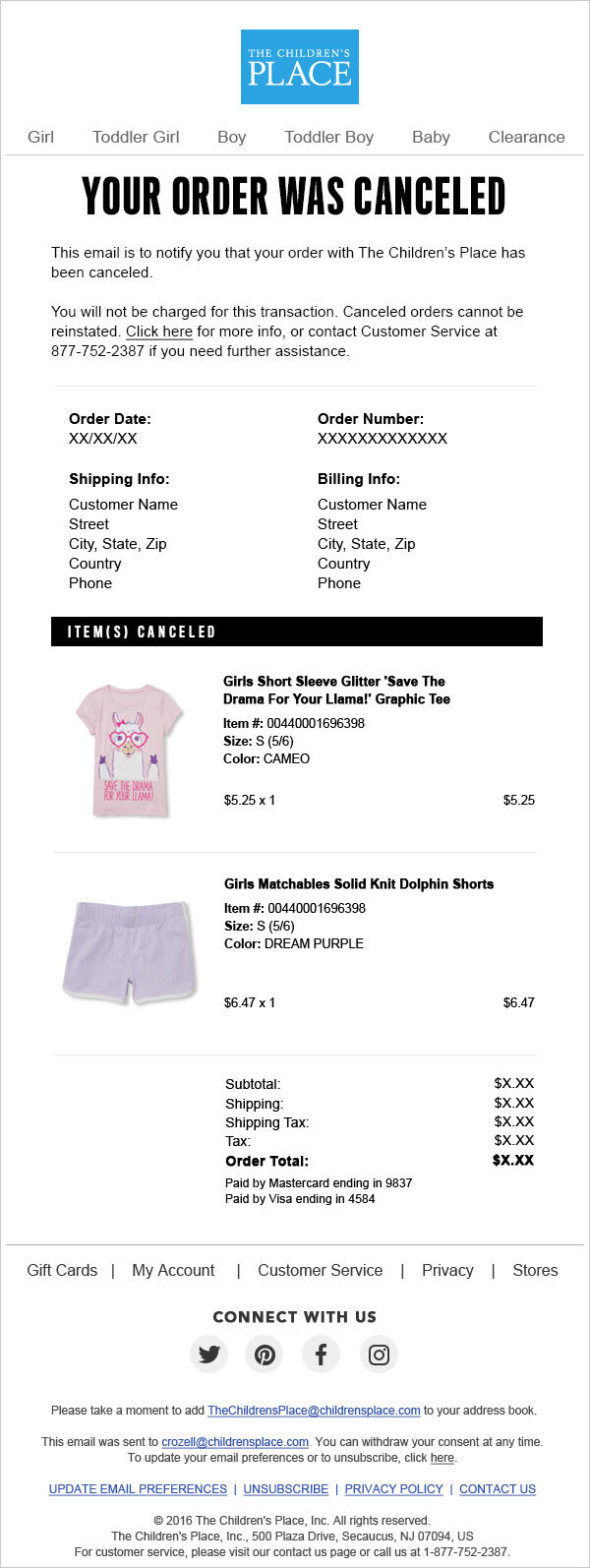
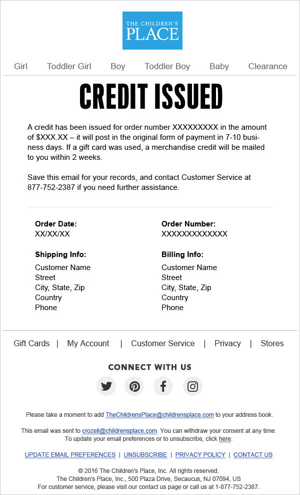
Shipping emails contained outdated artwork and little to no branding (see series below)
Some emails were long and also visually hard to read
Increased orders meant more packages and more risk for packing & shipping slowdowns; the series lacked communication about those possible (and untimely) events and Customer Service was outnumbered by all the incoming calls
Inspiration & Process
The teams did competitive research, discussing everything from header style and messaging to elements that would provide visual breaks. From what we saw, iconography or mascots and clear language seemed to be used by bigger brands that delivered more volume. Smaller or boutique brands communicated in a fun or particular voice, supplemented with clear information and visual details that truly matched their aesthetic.
We agreed that because we were a kids brand, our style could be slightly more playful either visually, linguistically or both. Below are order status communication styles we explored while working through the series (the original iteration was extra playful and not pictured here). The second iteration (left column set) was a crowd favorite, but our customer is an on-the-go parent so we ultimately favored bold simplicity (right column set) for ease of reading.

Outcome
Along with clear (but bold!) order statuses, unified subject lines and additional communications, we created a corresponding icon system to visually communicate what stage a customer was in. I also edited the long body copy and hard-to-read product sections into essential and digestible ones, and it all helped lighten the phone calls to our Customer Service team.


The Best Part?
It was a fun challenge to see where we could take the brand by exploring multiple iterations of a longer customer communication series, but this animation was also my favorite!